
Netflix
Case Study
ROLE
Product Designer
UX Researcher
TIMELINE
Jan - May 2024
SKILLS
User Research
Visual Design
UI Design
Design System
TOOLS
Figma
Notion
How might we reduce the time it takes for users to choose a film, and feel satisfied with what they chose to watch?
MAIN SOLUTION
Recommend to your friend a film they would like.
MAIN SOLUTION
View films that were recommended to you.
CONTEXT
What's the Problem?
Everyone has experienced endlessly scrolling on Netflix, having entered the app not knowing what to watch. You click on a thumbnail, you read the summary, you watch the preview… But in the end, nothing seems appealing and you end the tedious cycle by closing the app.
From this phenomenon, I wanted to research and find a better way for people to decide on what to watch.
USER RESEARCH
What Do the Users Say?
To validate my hypothesis, I conducted a total of 6 user interviews — those of four being frequent Netflix users and two having never used Netflix before. The interview involved questions such as their personal experiences with the platform, any obstacles they face using the app.
The key takeaways from the interviews were that:
🥲
Users found the process of looking through film choices tedious and on-platform film recommendations not resonant enough — resorting to content they are already familiar with.
🔥
Users usually depend on external factors when choosing what to watch, such as popularity, starring famous actors, and/or recommendations from close ones.
🤔
For non-netflix users, the popularity of a certain show alone did not persuade them enough to subscribe, though they were curious.
⭐️
Users wanted a more personalized list of recommendations that they could click into with no hesitation or doubt.
BRAINSTORMING
During the brainstorming process, I gathered three friends to ideate new potential solutions, keeping in mind this question:
"How might we shorten the time it takes to choose and watch a satisfying film?"
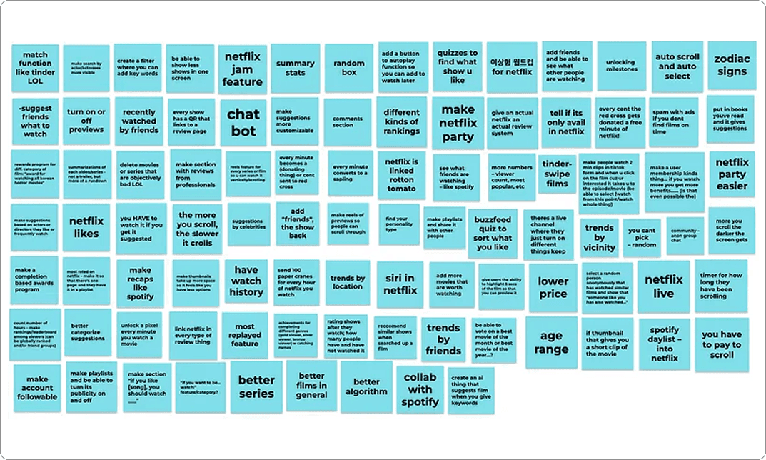
Using FigJam's sticky notes, we started the process with a brain dump of 100+ creative to silly ideas.
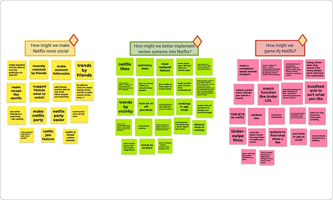
From there, we categorized the ideas and narrowed them into three best solution spaces.
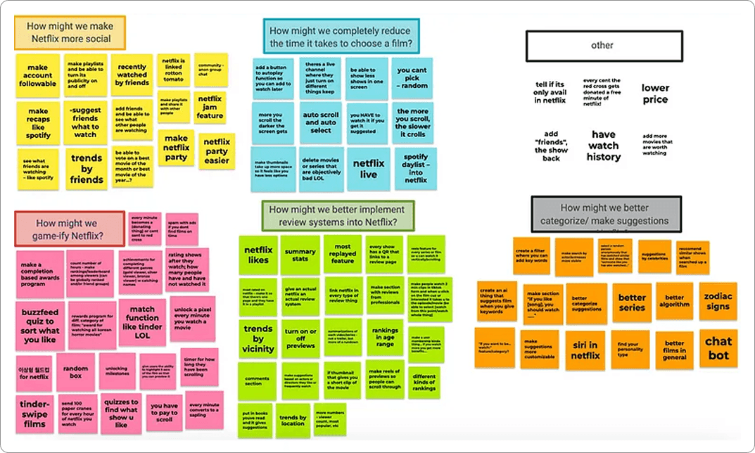
SOLUTION SPACES
After brainstorming, I decided on three potential solution spaces — social interaction, game elements, and better review systems — for the new feature. From here, I organized the pros and cons of each solution space to weigh the tradeoffs.
In the end, I decided on the space of social interaction as it aligned best with the goal of finding films that users can ensure they will enjoy.
Social Interaction
+
Your friends know you best — better personalized recommendations made by friends.
–
During user interviews, users appreciated Netflix's aspect of enjoying films in private.
Game Elements
+
Way to make choosing films an entertaining process, rather than a tiring one.
–
Does not align with Netflix's product tone and not something users expressed interest in.
Better Review
Systems
+
Provides more information a user can use to decide if they will enjoy the film.
–
Adds to the overwhelming searching experience, as it dumps more information to users.
FEATURE IDEATING
Having decided my solution space, I moved onto deciding a feature idea. Again, I had three ideas and weighed the pros and cons of each.
Discoverable profiles and movie playlists
Inspired by music platforms, I imagined giving users the option to turn their profiles public and share their own tasteful playlists. However, this risks distracting users from watching. Users also disliked public-facing profiles.
Scrollable Short-form content of Movie Clips/Previews
Users mentioned how they wanted a glimpse of the film before committing their time to it. But this mirrored short-form content platforms' endless-scroll trap; users would keep scrolling rather than commit.
Recommending Films to Added Friends
During user interviews, many participants' routes to watching a film were through personal recommendations from close ones. I chose this feature as it leverages trust from real relationships, directly addressing users' #1 path to choosing a film. Using unique IDs, user profiles could also be kept private.
FEATURE VISUALIZING
How Will the Features Look?
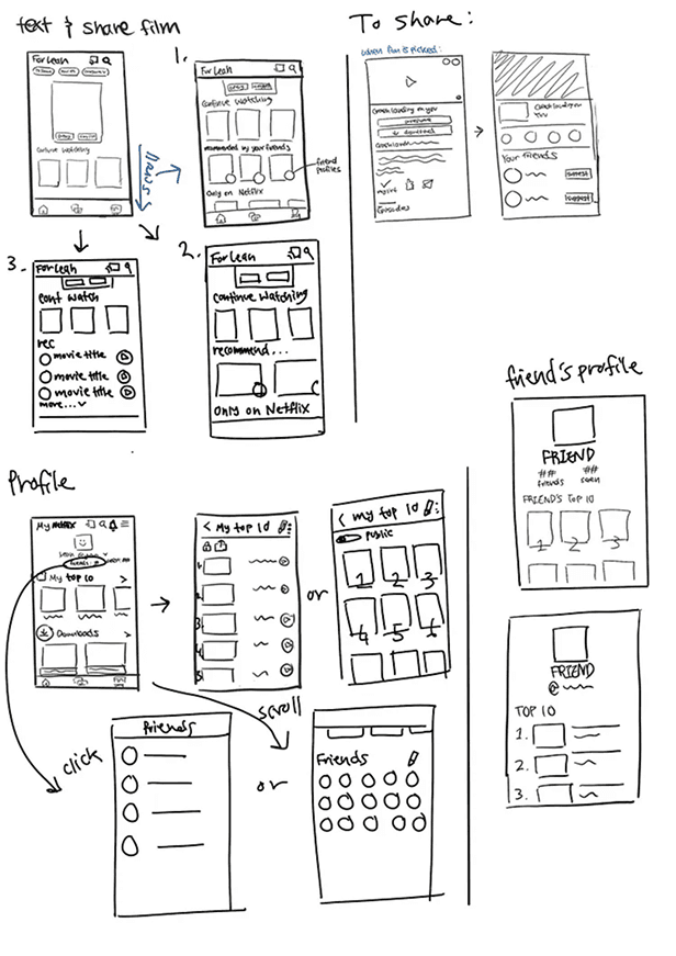
With my feature in mind, I went into sketching iterations low-fidelity screens to ideate how it would actually look like. Initially, I included Direct Messaging features but removed it later on as I wanted keep the platform private and focused to watching films. A snippet of my sketches are shown below (Left image).
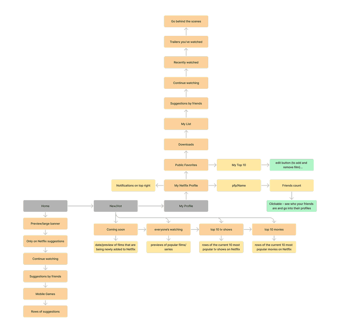
Using the low fi sketches as reference, I created an information hierarchy diagram to exemplify which direction a user would have to go to land on certain features (Right image).
DESIGN EXPLORATIONS
What is the Most Effective Design?
Moving onto Mid-Fidelity sketches, I explored different ways to represent each feature layout.
Sending Recommendations
Use Share Button to Recommend
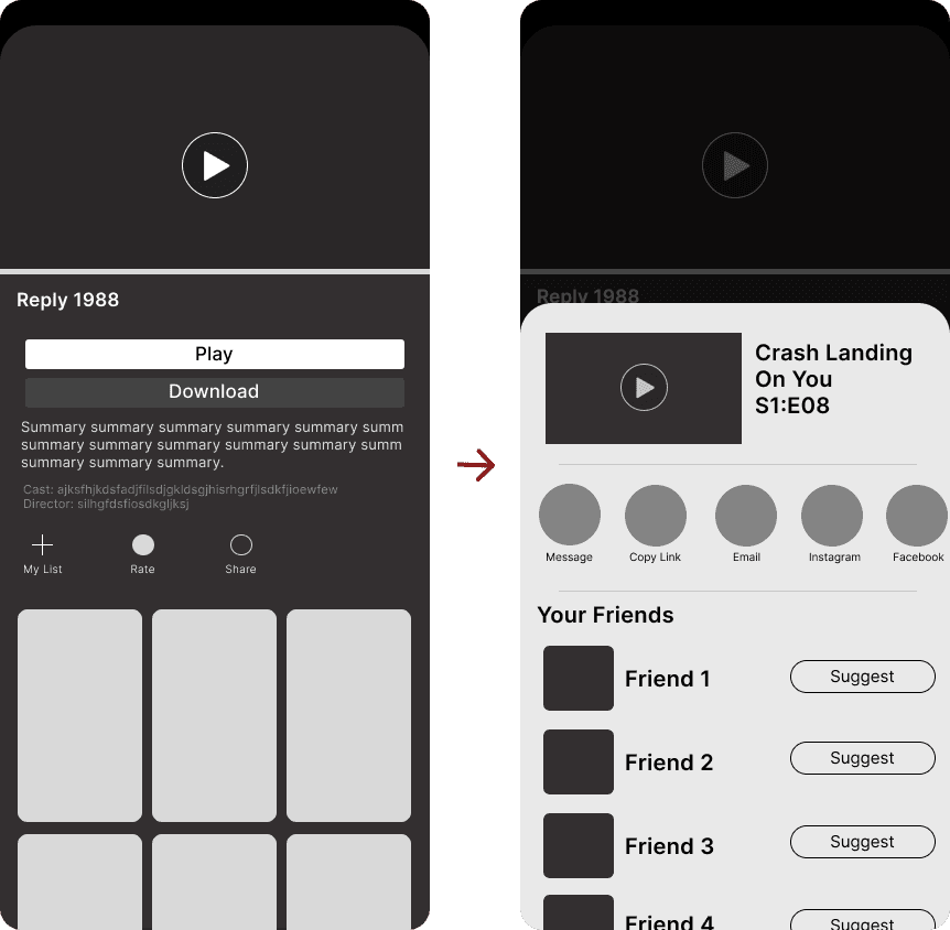
✅ Less buttons, simple display
❌ Suggesting films not expected in share
❌ Users might face difficulty in finding out about the feature and where to find it
💖 Separate Recommendation Button
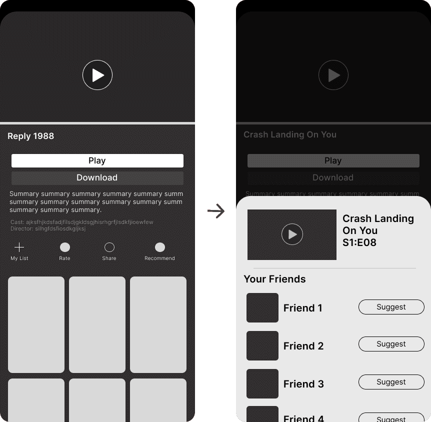
✅ Easy to notice and more intuitive to use
✅ Better distinguish the ability to sharing films internally and externally
❌ Slight more clutter, however a small difference
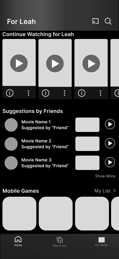
Initially, I imagined the recommending feature to be integrated into "Share." However, I realized that would hide the feature itself as well as cause confusion to the users. So, I decided creating a separate button for better clarity and went with the iteration on the right.
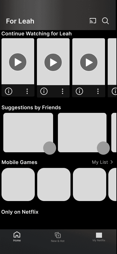
Viewing Suggestions - Feed
💖 Cards with Profiles
✅ Aligns with rest of the app
✅ Placed near the top — can be easily and quickly found
❌ Hard to differentiate with other rows
Larger Cards with Profiles
✅ Shows two films at a time, less overwhelming
✅ Differentiates the feature
❌ Doesn't align with overall UI
Playlist Form
✅ Unique layout, can be eyecatching
❌ Disjointed from the rest of the app
❌ hard to differentiate with other rows
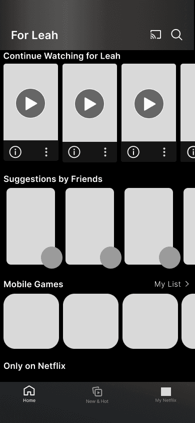
For the most efficient movements and for the convenience of users, I placed the entry point of the feature under "Continue Watching…". If a user enters the app to finish watching they can get to it the fastest, but if the user's wants is to watch something new, its most personalized recommendations will be right under.
For the UI, when choosing the cards' style I decided on the slender version, so that it would be more consistent.
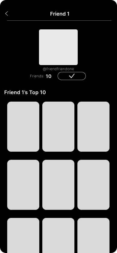
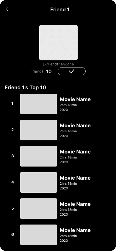
Viewing Suggestions - Profile
List of Thumbnails
❌ Visually unbalanced when seeing all ten thumbnails at once
❌ Can add onto the overwhelming experience
List Form in Rows
✅ Listing layout familiar to users
❌ Discomfort in having to scroll + content after it can get overlooked
💖
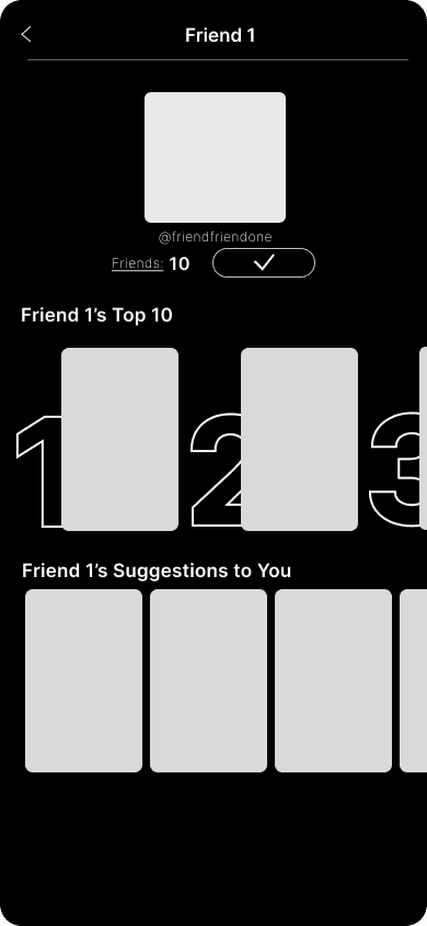
✅ Sectioning and layout similar to the home screen — familiar to users
✅ Organized and clean at first glance
For lists and recommendations per profile, the last iteration was chosen as it provides familiarity from the home screen and also a sense of organization. It shows two different sections, a user's top ten showcasing their favorite films as well as their suggestions to you, and an option to move onto another page if the user wants an extended version.
KEEPING IN MIND
Two guiding principles shaped every high-fidelity decision:
Do the elements of the feature blend in well with the original design elements of Netflix?
Is the design of each new feature intuitive, recognizable, concise, and easy to follow with little to no explanation?
HIGH FIDELITY FLOWS
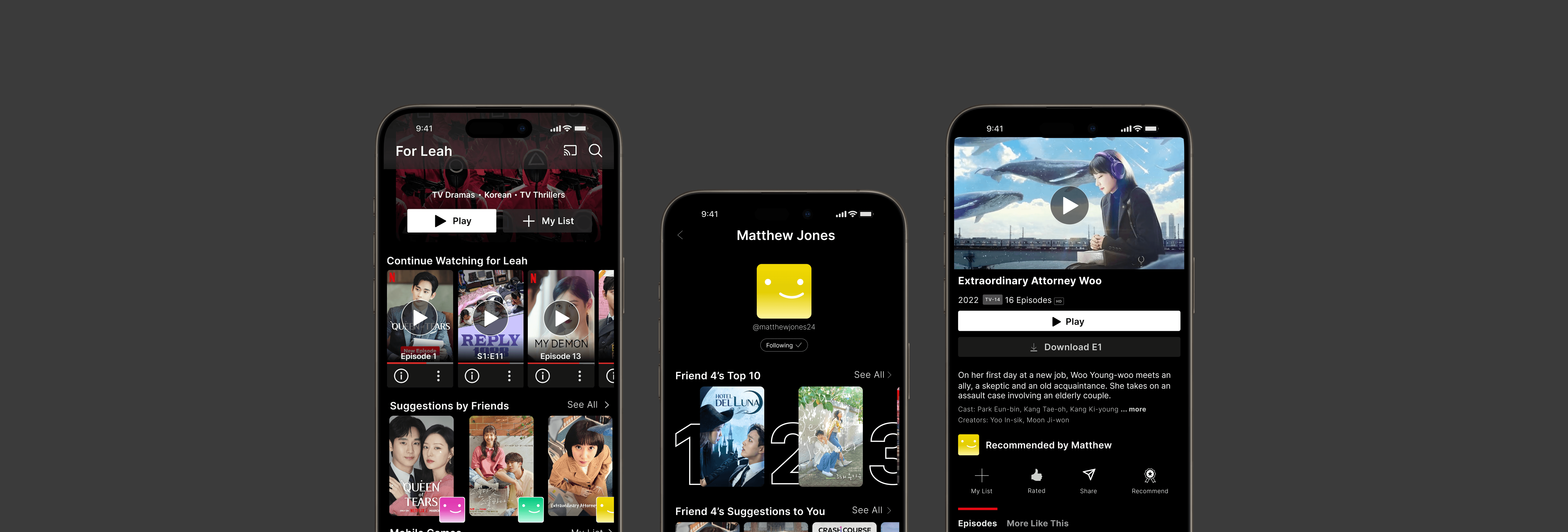
The final design introduces two connected flows – sending a film recommendation to a specific friend, and viewing films friends have recommended to you.
MAIN SOLUTION
Recommend to your friend a film they would like.
MAIN SOLUTION
View films that were recommended to you.
CONCLUSION
My Reflections
This was my very first design case study, where I was able to learn largely about the importance of user research. It was a valuable experience being able to craft designs based on real user needs. Some key things I took away were:
🔍
User needs > Aesthetics
During the design process, I struggled deciding between what I thought was visually appealing and what was more effective in user experience. I learned that the user should always come first.
👫
User decisions are based on trust
Users didn't distrust Netflix's algorithm because it was bad, but it felt impersonal. Users want to feel seen and known.
If I had more time, I would've…
🍀
Incorporate usability testing
Incorporating usability testing interviews of the high-fidelity prototypes would have helped me gain insight into my own features, creating space for final refinements.
📋
Explore how user profiles can be more effective
I created user profiles and film rankings so that friends could interact with one another. However, I could've researched additional features that could make the space more effective.
Let's talk about our deepest dreamiest ideas ❦
LK552@cornell.edu
Made with <3 by Leah Kim © 2025